Case Study
Library Mobile App

CLIENT
wrkspace
TEAM
Justin Lloyd, Philip Yoon, and Rob Eisenbach
ROLE
Client Lead, UX Designer, Research Lead
TIMELINE
3 Week Design Sprint
WORK
Create a Mobile App Prototype
Case Summary
UPDATE THIS - THIS IS FROM LIB APP
This was a short engagement the founders of wrkspace.com, a startup co-working space aggregator based in Los Angeles, CA.
The team had 2.5 weeks to build a proof-of-concept mobile app for a library of our choosing. The challenge: build an app that promotes the variety of services that libraries provide today given their service offerings have expanded greatly, especially since the pandemic.
On this project I served as team leader and project manager, led most of our research efforts (discovery, synthesis, and user testing), and designed the app user experience for the Katrina persona.
While this case is a detailed dive, but feel free to use the links below to skip around. Or click on Figma File below and dive into my work. This effort was part of General Assembly's full-time UX Design Immersive.
Sections
new title - more professional
How do you promote all the programs, services, and benefits of a modern public library?
The Brief - update
Requirements
Revamp the user experience of one library's mobile app to showcase its diversified offerings
Explore and present the range of items available for lending, along with programs and services offered
Consider how the redesigned app can positively reshape the common perception of libraries, focusing on enhancing awareness about their varied services and programs
Determine the target user(s) of this app
Determine the Information Architecture for all services, programs, and benefits
Create a search engine (concept) that doesn’t flood the user with tons of options
Constraints
Create a POC mobile or tablet app
Use either iOS (HIG) or Android (Material Design) design systems
We had limited access to public library apps because each requires a library card
Tools
Figma and Figjam
Trello
Clockify
ZOOM
Fathom AI
Apple iOS SF Symbols and Fonts
G Suite
Slack
Research and Analysis
When is the last time you checked out your local public library's website? Chances are it's a bit dated.
Deliverables
Research Plan / User Interview Questions
Library Offerings Landscape
Competitive/Comparative Analysis (Design)
User Interview Videos, Summaries and Transcripts
Online Survey
Public libraries have a lot in common in their digital efforts. Most don't have the funding or staff to invest in their online presence or in creating and managing mobile applications so their online efforts are not designed well nor are they easy to navigate.
Looking for a best-in-class library for our project, we searched dozens of public library websites and narrowed our list to eight (8). Of those eight, Los Angeles Public Library (LAPL) stood out for its breadth of offerings, its multiple media labs and maker spaces, and its other non-traditional library offerings (e.g., memory labs). Those attributes plus a modern website design and colorful aesthetic led us to choose LAPL for our project.
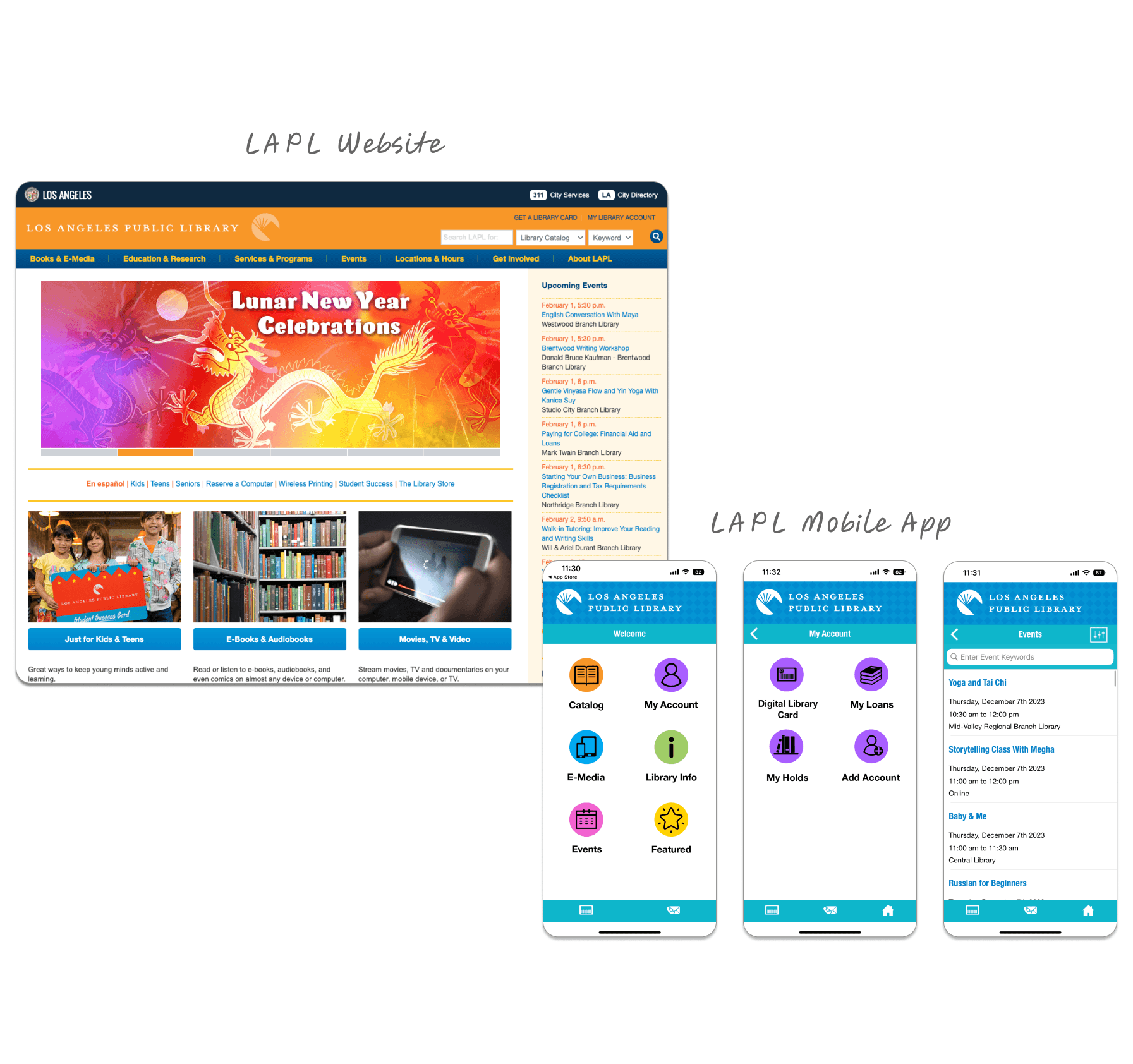
We noted that LAPL's mobile app (above right) was not as thoughtfully designed as their website and seemed to have limited functionality. We suspect that most libraries that have a mobile app pay a vendor to use their white label app. This would account for the differences in design aesthetic.
Competitive Analysis

We also started benchmarking the designs and functionality of other library applications, looking for patterns and heuristics around how users access library services. Three of the best we found were the New York public library, San Diego PL, and the Libby app, a fan favorite.
User Research
I planned the initial user research phase of the project, identifying the research objectives, key decisions to be made, and an initial set of questions for our first interview targets: "library gurus" (people who work at libraries) and current library users.
As the team learned, I continued to update the research plan, sharpening its focus and attempting to keep the team on the same page while we all moved forward quickly with interviews.
Stakeholder Interviews
Two days after we kicked off the project, I interviewed a philanthropy director who works closely with Denver Public Library (DPL). She and I did a deep dive into how DPL was investing in counseling resources and other services, and how they had just launched a mobile app. Subsequently, I conducted interviews with three other DPL employees.
Later sharing this initial interview with the team, we finalized four types of users to interview: library users, non-users, library gurus, and people who are passionate about making things, either physically or digitally.
User Interviews
The team interviewed eleven (11) potentially users with a good cross-section of passionate library users, non-users, and makers, the latter to get feedback on LAPL's media labs and other "avant guard" library offerings.
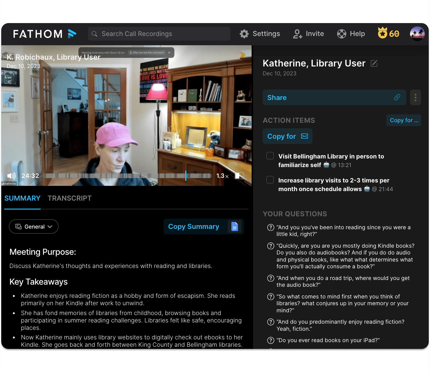
My primary tool for documenting user interviews was ZOOM paired with Fathom AI, which automatically generated a video recording, interview summary, and transcript of all my interviews.
Key Learnings
Attitudes and perceptions of libraries stratify mostly along generational lines: older users tended to be more passionate about libraries, while younger users perceived them as being outdated and not relevant in the age of the internet.
Users who were passionate about libraries tended to have formative childhood experiences around libraries that have stayed with them throughout their adulthood.
Even those who perceived libraries as being outdated were intrigued and a little excited about non-traditional services like media labs and borrowing power tools.
Synthesis
Given the scope of the project, it was important to get a variety of viewpoints, which left us with A LOT of data that needed to be synthesized quickly.
Deliverables
User Insights and themes (Affinity Mapping)
Personas
Problem and Solution Statements
Feature Prioritization
Site Map
I led most of the research synthesis activities for the team, including affinity mapping, feature prioritization, and the approach to creating personas.
Affinity Mapping
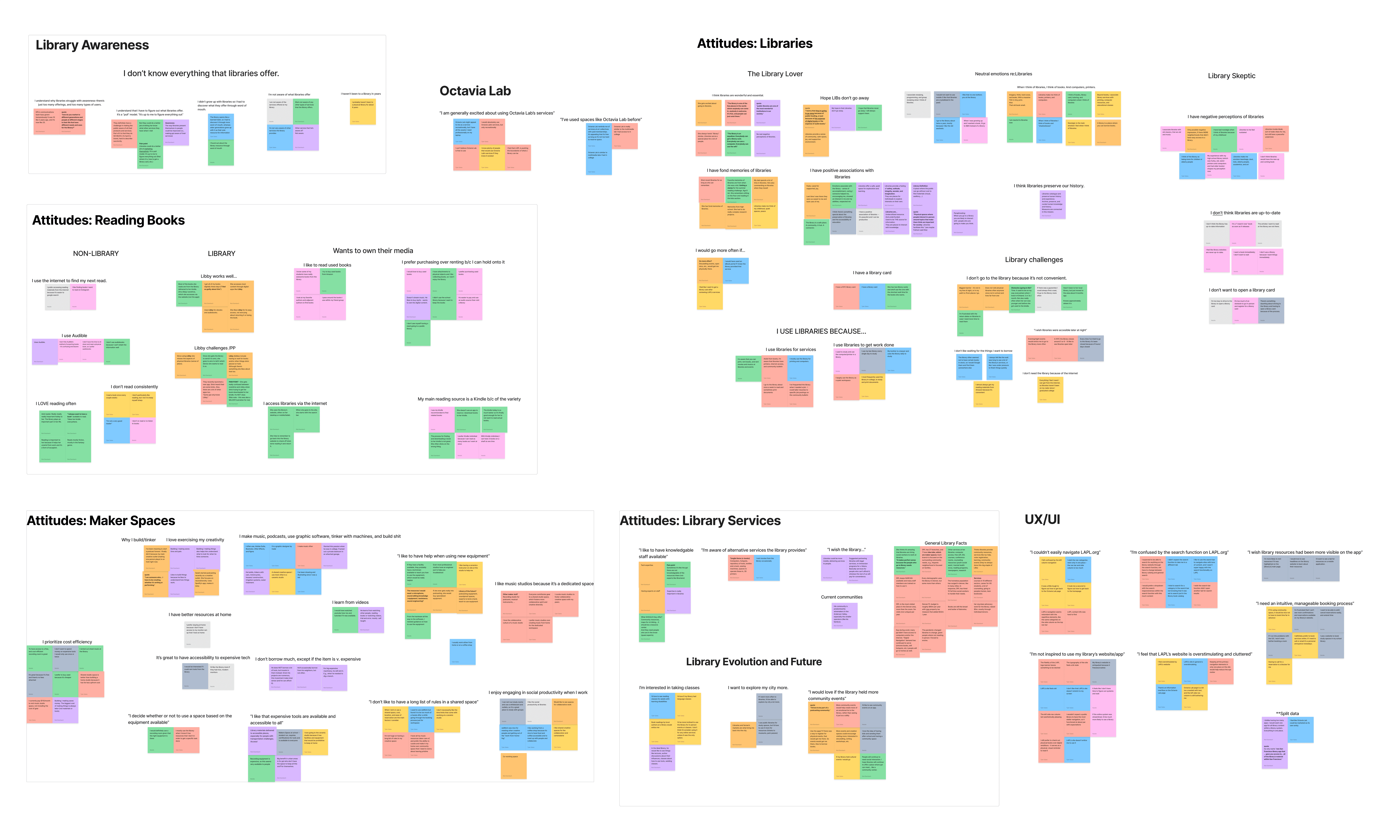
In preparation for a team affinity mapping session, each of us converted our notes into virtual stickies on a Figjam board to summarize the key learnings that would be most helpful for crafting personas later. We then assembled our stickies into clusters and created I-statements for each, e.g., "I love exercising my creativity" and "I'm not aware of what libraries offer."
Then, through two marathon team ZOOM sessions, we did multiple iterations of combining (and breaking apart) clusters to come to a common agreement of the most important themes of our research. We did this until we we felt like the themes were actionable for persona development.
In total, we developed over 60 different themes from user research using this technique.
Persona Development
Given the number of themes we had, I thought it would be best if we created a 2X2 matrix trying various themes on the X and Y axes. Intuitively, I wanted to use attitudes and behaviors for these dimensions because I believed they would be more actionable than user needs or pain points and the fact that the business objective of the app was to grow the user base of modern libraries' offerings.
The first dimension I chose was "attitudes about libraries," specifically, the continuum from being very enthusiastic about using library services and resources to being very skeptical of libraries' usefulness.
This was a great dimension because the team had this data on all users interviewed.

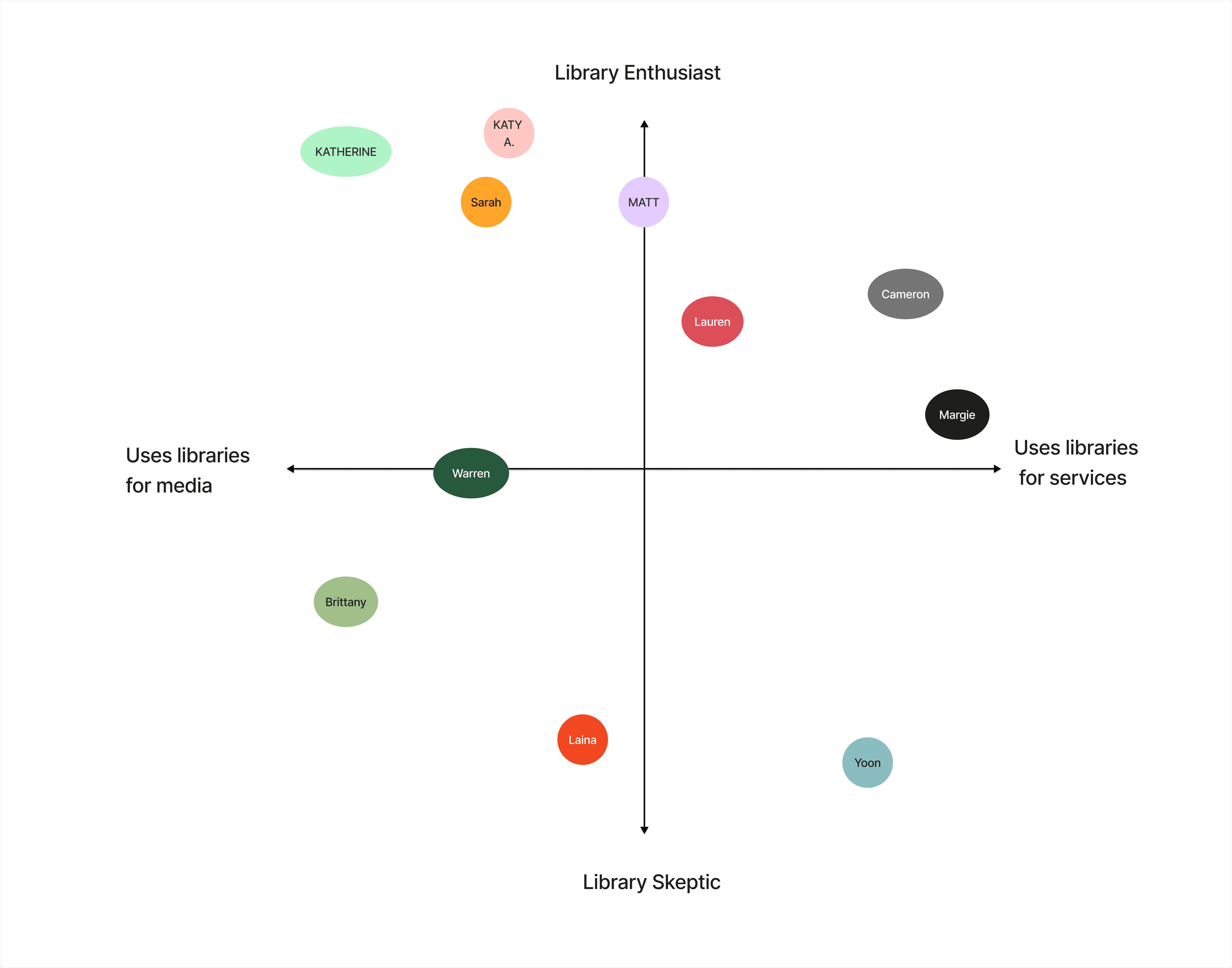
Next, we tried various dimensions along the X-axis, including how users would primarily use the library: for borrowing items or for using onsite services. We mapped our interviewees on this matrix (see above). What troubled me about this dimension, though, was that it was not a continuum and that both statements could be true for each user. The dimension was also a projection of future user behavior.
To fix this, I envisioned a new continuum based the data we collected on user media consumption and what we knew about their creative efforts, having probed on both. Using time as the continuous element, we projected where users would fall from spending more time consuming media to spending more time "creating things".
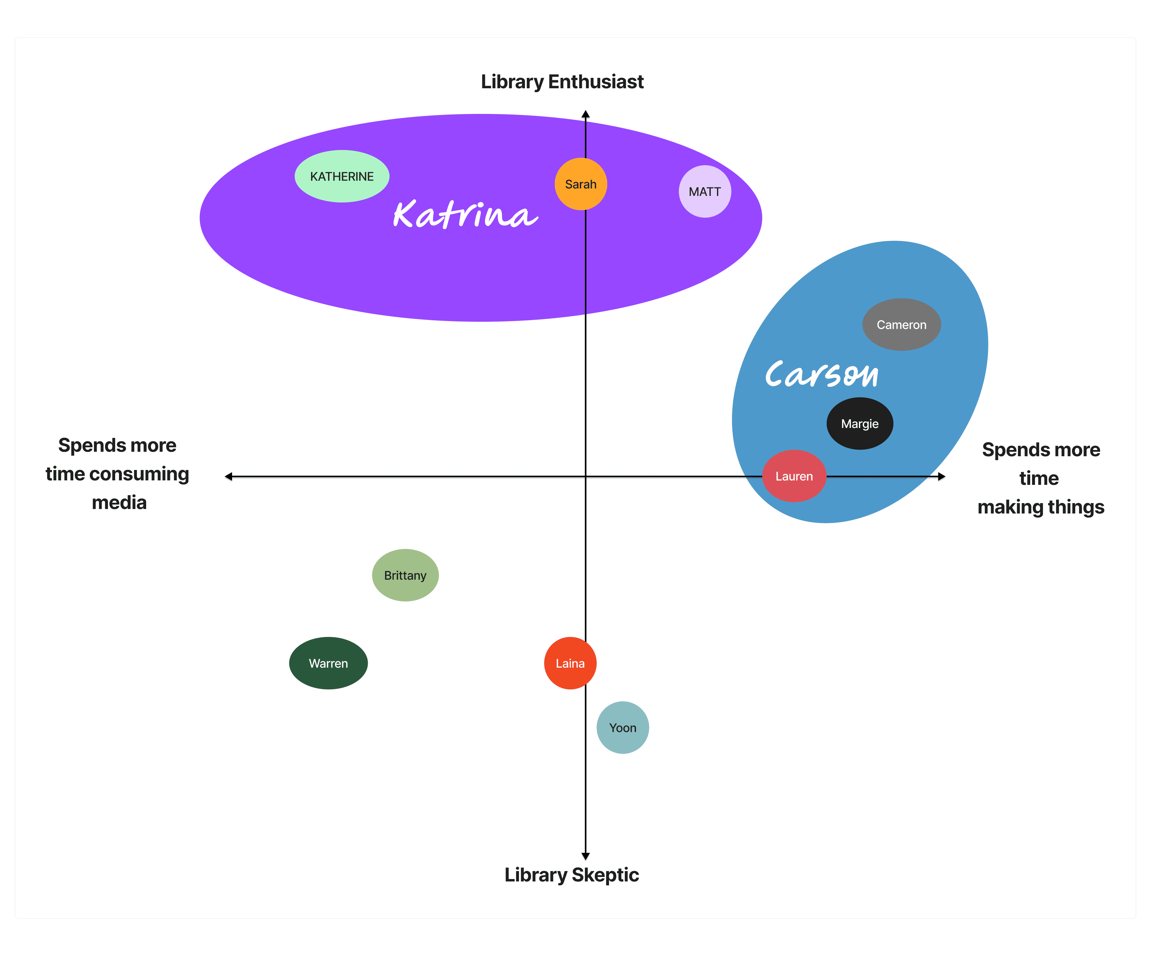
This new dimension resulted in two attractive user groups: one, a library enthusiast who uses the library for accessing media (mostly borrowing ebooks and audiobooks), and two, someone who is lower in enthusiasm for libraries but would be very interested in using/ borrowing creative tools like media labs, 3D printers, power tools. We named them Katrina and Carson, respectively and developed full persona characteristics around them.
We decided not to develop a third persona for those users who were more skeptical of libraries. Given the limited ability for libraries in general to market their offerings, this potential third persona would not be a high priority.

NEEDS
Always wants to have a digital book on hand
Wants to be more informed on her local library resources
Will always support library funding.
BEHAVIORS
Avid reader - her biggest hobby
Consumes video content, esp Netflix
Primarily uses the library’s website to access ebooks (kindle) or audiobooks
Exposed her child at an early age to libraries
PAINS
Gets confused with the process and apps involved with getting ebooks onto her kindle
Hates waiting for the book she wants to read
Hates waiting for the next book to come out in a series
ATTITUDES/ BELIEFS
Passionate about libraries and the services they provide, especially for underprivileged people
Wants libraries to be part of her ever day life
Loves the convenience of being able to access and store many books on her Kindle
Problem and Solution Statements
Now that we had well defined personas in Katrina and Carson, it was time to formulate their problem statements.
Katrina
Katrina needs a better way to discover how to engage with her new local library because she just moved to Los Angeles and doesn’t know how to get more involved.
Carson
Carson, a recent college grad, needs access to a cost-friendly recording space because he no longer has access to his college music production studio and he doesn't have the funds to buy his own equipment.
Solution Statement
Create a new mobile app for LAPL that provides a personalized user experience that promotes relevant services and programs based on the unique needs and interests of the user.
Feature Prioritization
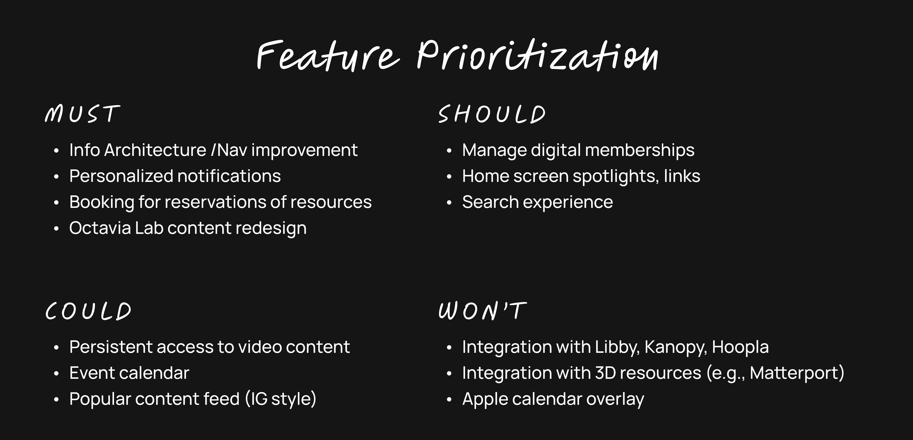
I led the team through generating the list of features we could offer in the Library App. We then used the MoSCoW method (must, should, could, won't) to determine a starting list of features we would design in our prototype. Here are the main items we discussed:
Information arch and navigation Improvements
Personalization and custom notifications
Phone-based library orientation
Digital memberships incl. media labs
Booking reservations for resources and spaces
Homepage spotlights
Integration with Libby, Kanopy, and Hoopla
Search experience
Octavia Lab redesign
Persistent access to video “how to” content
Events
Improve access
Integration with 3D virtual spaces
What’s popular in the library (e.g., IG scroll)
Next, we did a Moscow analysis of these features, and came up with the following must's, should's, could's, and wont's.
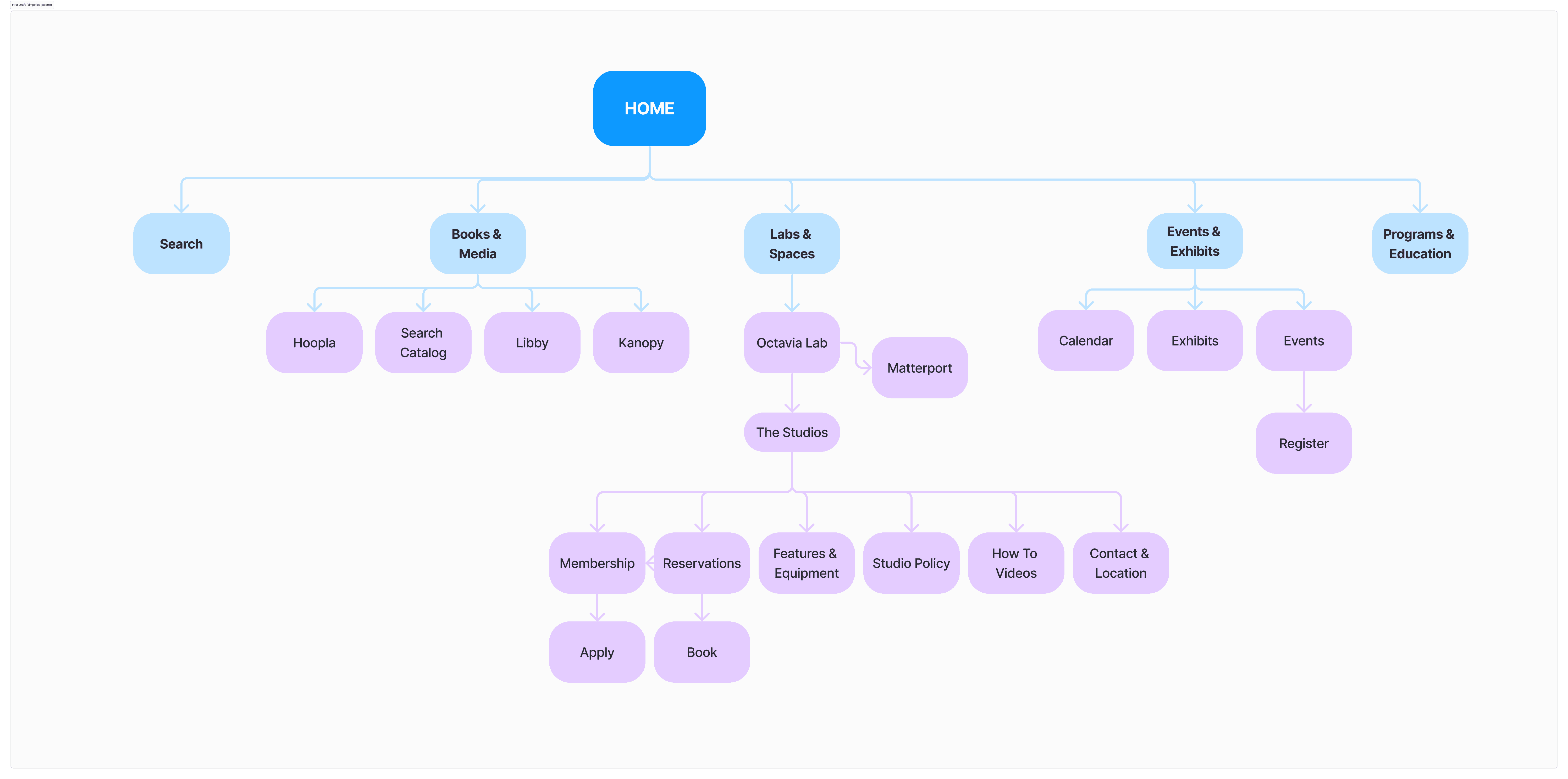
Site Map
The final step before we could begin our designs was reimagining the information architecture for the entire LA Public Library. This was obviously no small task so we needed to limit the scope of what we would touch. One of my teammates initiated this process by downloading the current site map for the LAPL (and it is massive!).
Then through a series of collaborative card sorting exercises, we came up with the following site map that we would use for initial sketches and wireframes.
Sketching
We conducted several collaborative sketching sessions over the course of the project to develop and evolve our visual ideas.
Deliverables
Design Studio
Initial Screen Sketches
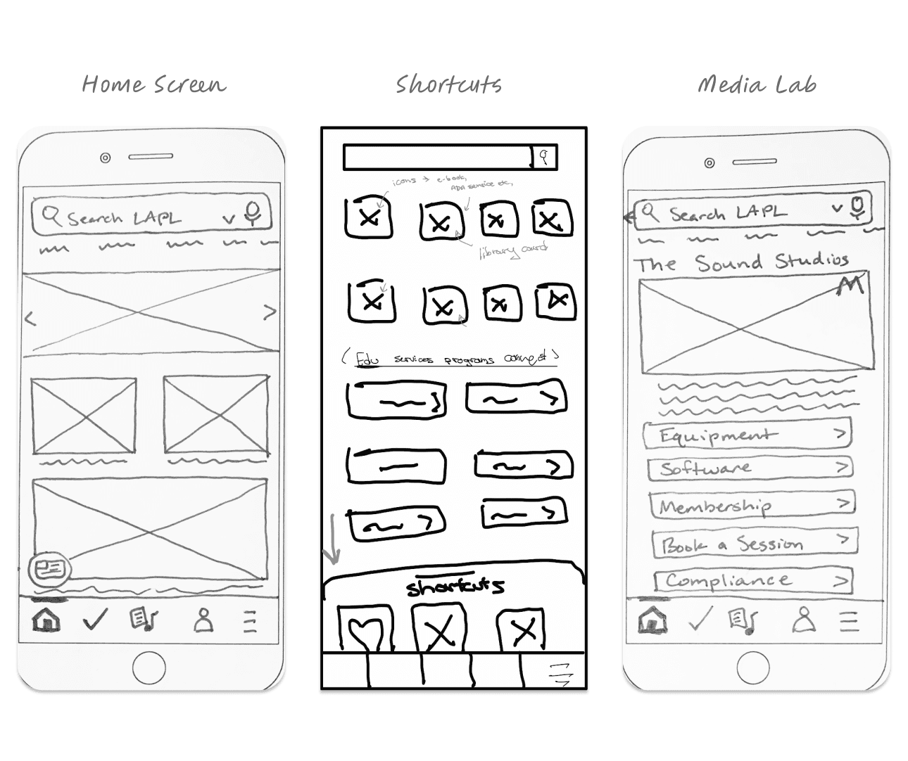
To kick off the visual design of the new mobile app, the team did a group "design studio" where we sketched, gave each other feedback, and sketched again iteratively in a 30 min session. This was a great way to get some initial ideas on paper as well as start to develop some consensus around what we liked and wanted to accomplish visually.
Here are some of my early sketches from the design studio.

I was responsible for designing how we would customize the app experience for our users. Here's a preliminary sketch as I started to organize my ideas around creating a profile and customizing notifications.

Just before wireframing, the team did another design studio around the primary screens we intended to design, including the home, shortcuts, and media lab screens (see below).
Design System
We created a scalable design system that would allow us to publish nearly every screen on the site map.
Deliverables
Style Guide
Figma Components
Navigation Approach
Style Guide
LAPL uses many beautiful colors on its website. I counted at least nine (9) colors used in various situations. In one sense so much color communicates the many diverse communities in Los Angeles. But so much color can be a little bit overwhelming.

We wanted to use color more strategically. We chose one brand color, a primary highlight color, a second highlight / hyperlink color, and a background color (see below). Some of these were taken directly from the LAPL website, while others were slight modifications. We also created a new grayscale based on pure black and white.
We spent the most time tweaking the background (BG) color to balance the warmth we desired with readability and contrast. Pure white (FFFFFF) was also considered, but it made the app experience feel cold.
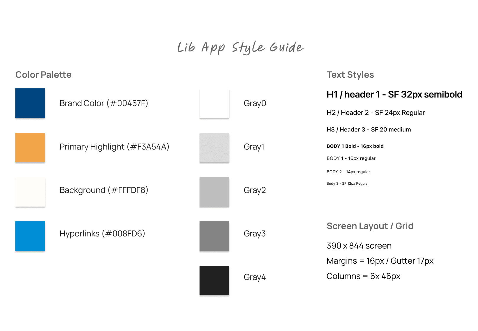
Having chosen the iPhone as our designated platform, we moved forward with the iOS design system and selected seven fonts from the SF Pro typeface (see above).
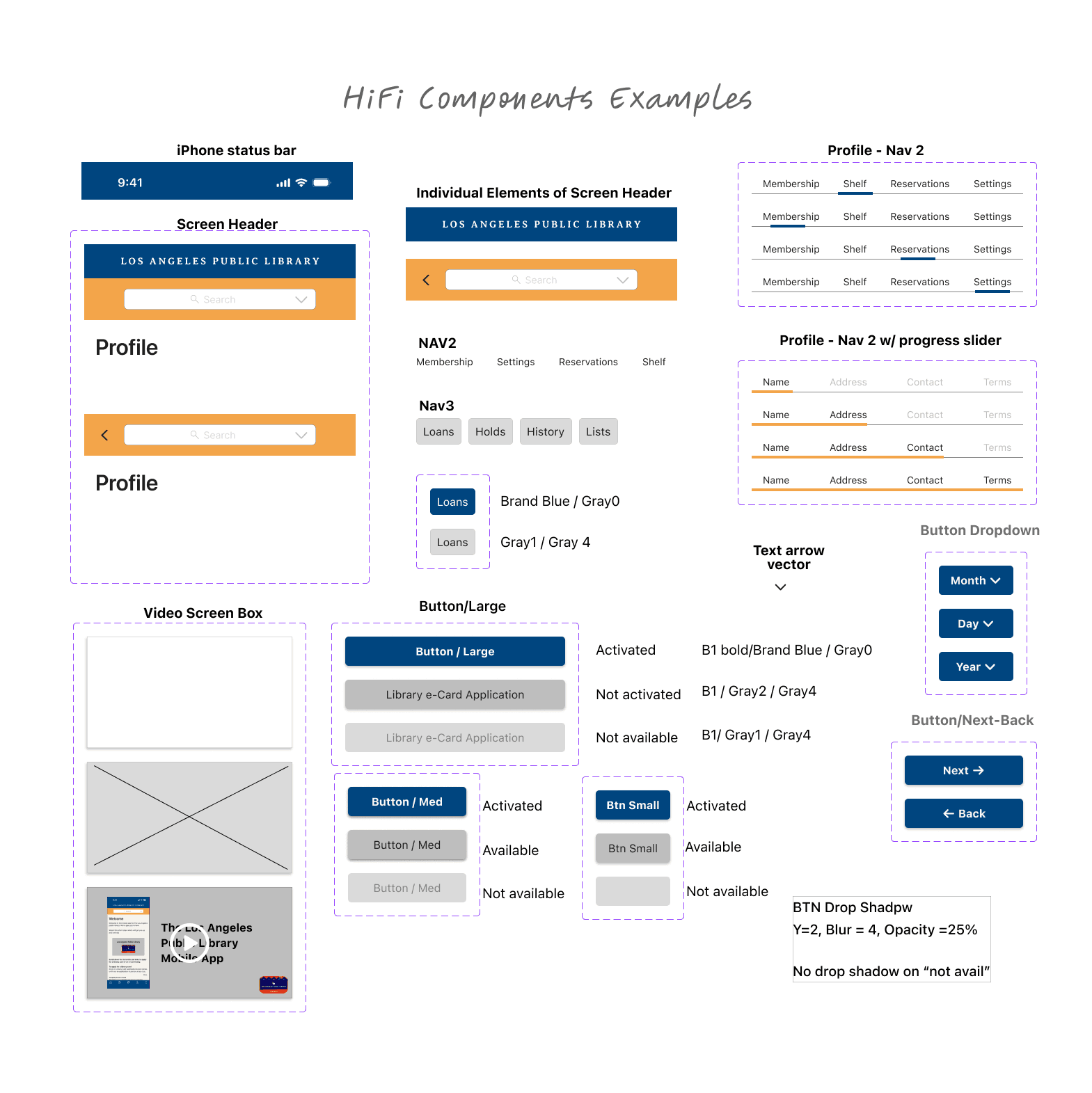
Figma Components
As all three of us were focused on designing separate screens and user experiences in parallel, using the same components was challenging. We each individually created components during wireframing and then consolidated our components during the final mockup stage. This approach wasn't perfect, nor did it lead to total consistency, but given the time constraints on the project, it allowed us to move quickly.
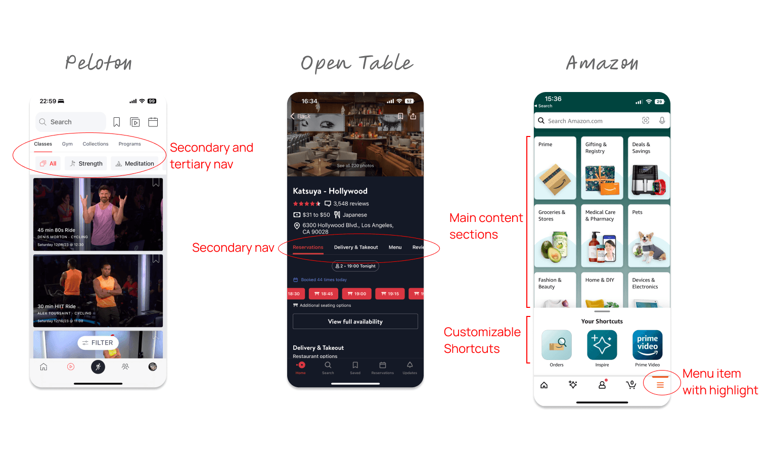
Navigation
We benchmarked other apps and ultimately drew inspiration from these three mobile apps (see below). Peloton.com and opentable.com helped us formulate our third level of situational navigation in the app. We followed Amazon's example by creating a page of links to important content collections accessed via a global nav button.
Wireframing and Testing
As we moved from sketching into wireframes, we iterated quickly, testing with users on a daily basis.
Deliverables
Low/Mid Fidelity Prototypes
User Testing Summaries
Recommended Design Changes
Wireframing and Testing
Our deep dive into discovery research meant we had less time for design. To accelerate the design process and ensure ensure we made our deadline, we began user testing with a combination of both hand sketches and wireframes.
We had a compressed timeframe to get user feedback and progress our designs for the final presentation. User testing occurred over a span of four (4) days. As such, we conducted the first test on a combination of sketches and simple lo-fi wireframes, with the last tests on a high-fidelity mockup.
Once of the experiences I converted it into wire frames and tested was how users would customize their library app experience. I put the settings under the profile global NAV option. I also applied the learnings from the aforementioned app, inspiration and creating 3rd level contextual navigation (see below).
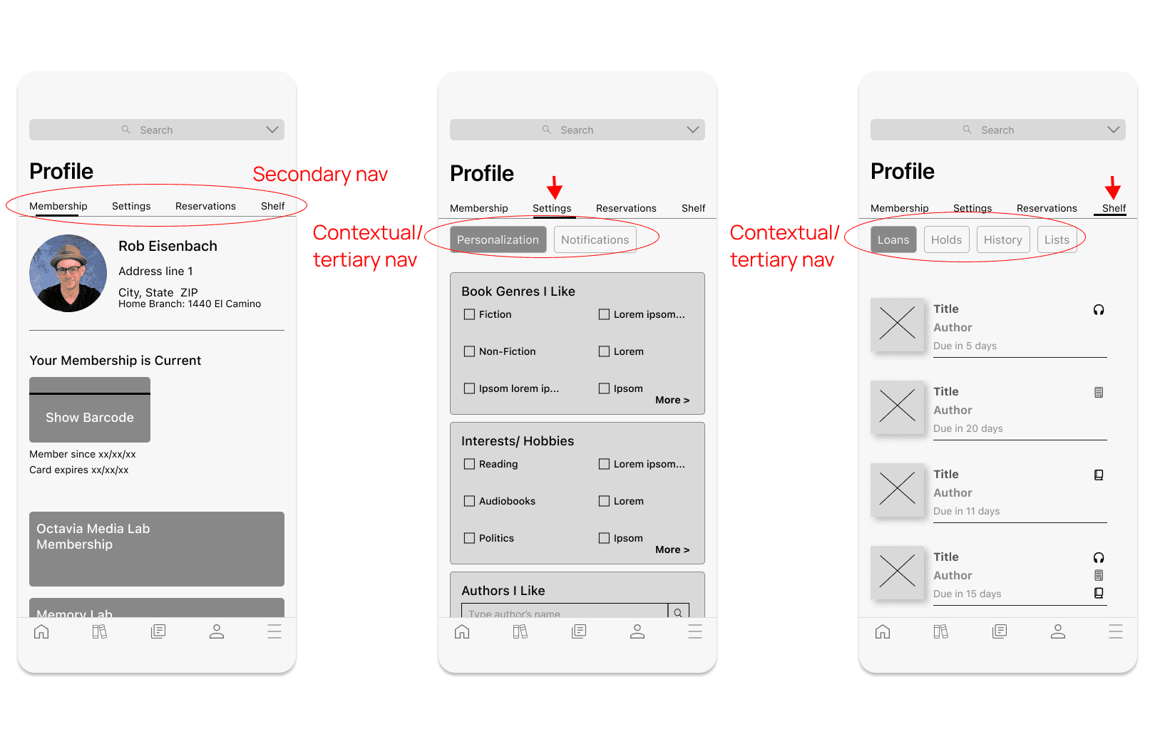
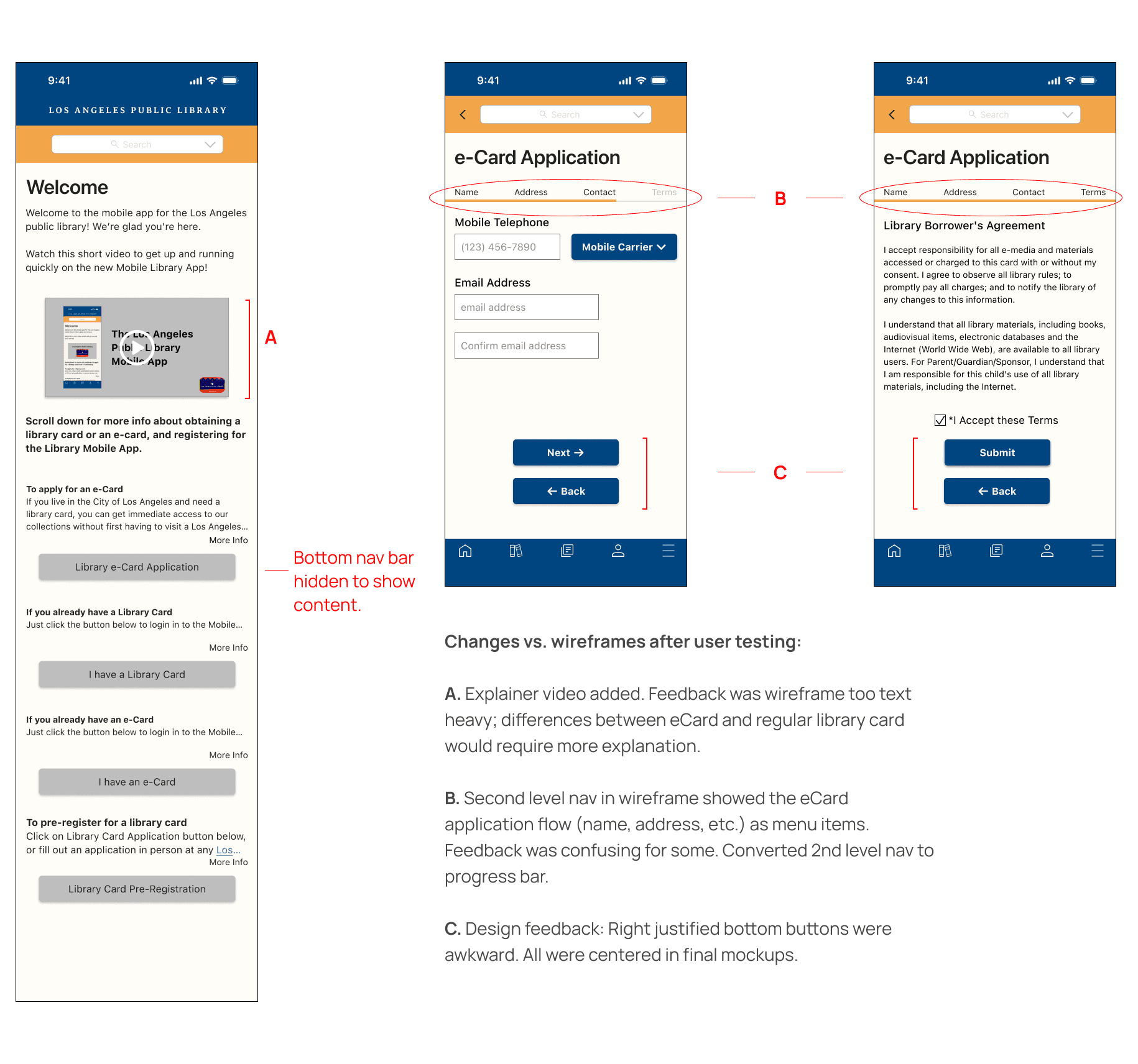
I was also responsible for the "first usage" experience where users would gain access to Lib App for the first time. The screens below are mid-fi wires around creating an account where the user doesn't already have a library card.

User Feedback
Functionality
Letting users choose a home branch location is important
Users use library names not addresses for their favorite location
Events filters needed: 1) age group, 2) location, and 3) date
Users like to see their reading/ loan history
Make personalization optional with default opted out
The difference between library Card and eCard was not clear in the app
Make the eCard registration one scrollable screen
Design
Drop the saturation on the background for increased contrast and accessibility
Increase side margins in general on the app
Increase “white space” on the homepage among all of the images
Increase the legibility of text overlays on homepage images
Users liked the library card icon overlay on the homepage, but need a way to spotlight it so users can see it
Final Mockups and Prototype
Fifteen days after beginning this project, the team had a functioning proof of concept prototype for the Lib App.
Deliverables
High Fidelity Mockup Screens
Figma Prototype for each Persona
The team iterated our designs over four days of user testing.
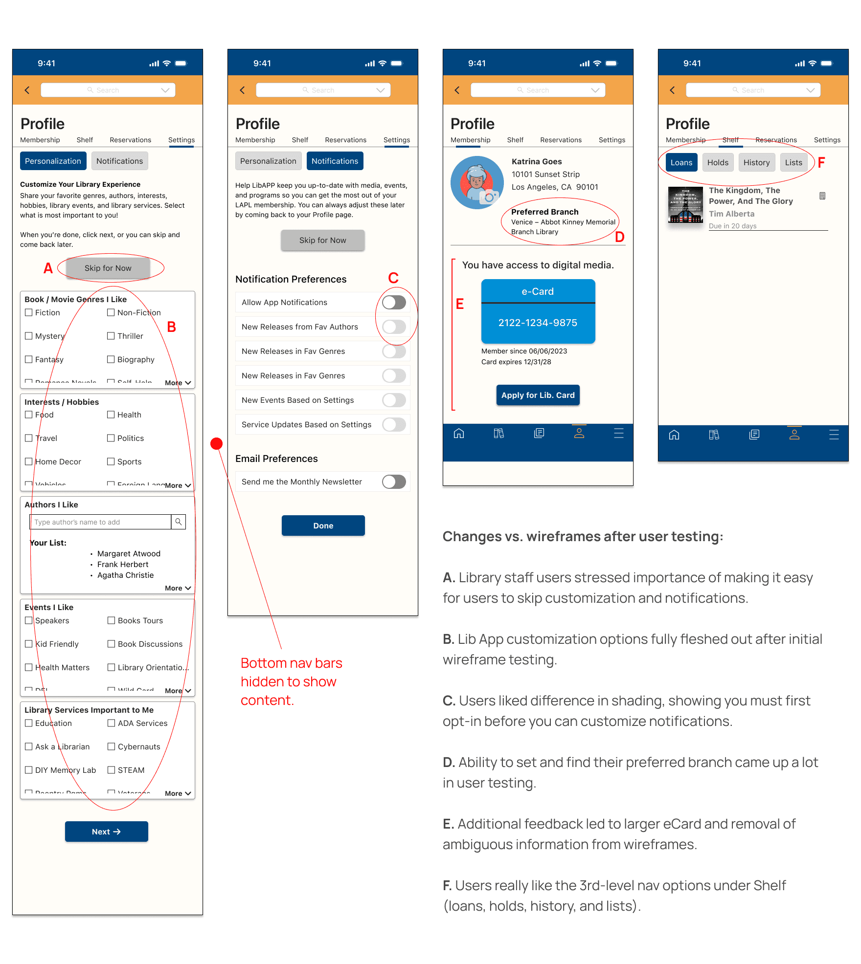
I was responsible for developing the app's initial user experiences around first time usage and app customization. Below are examples of the final mockups for the eCard application process I developed, annotated with changes from the initial wires.
And here are examples of some of the final Profile mockup screens I developed, with changes vs. wireframes annotated.
Figma Hi-Fi Prototype
This iframe shows the functional prototype for both personas: Katrina and Carson.
The Katrina user flow starts with the app's welcome screen and goes through the entire app setup process. This is where the user lands when they open the app and have not registered.
Start by clicking "Library e-Card application". Move through all the application screens until confirmation. Then move through the login screens and the profile customization screens until app setup is complete.
The Carson user flow, which was developed by my teammates, starts with the Home screen. Click "Labs" in the 2nd level nav and then click the Sound Studios card to move through the lab card registration process.
You can access the entire Figma file as well (see button).
Learnings & Next Steps
Under Construction
This iframe shows the functional prototype for both personas: Katrina and Carson.
The Katrina user flow starts with the app's welcome screen and goes through the entire app setup process. This is where the user lands when they open the app and have not registered.
Start by clicking "Library e-Card application". Move through all the application screens until confirmation. Then move through the login screens and the profile customization screens until app setup is complete.
The Carson user flow, which was developed by my teammates, starts with the Home screen. Click "Labs" in the 2nd level nav and then click the Sound Studios card to move through the lab card registration process.
You can access the entire Figma file as well (see button).
