Case Study
Amoeba Music
ROLE
UX Designer
TIMELINE
3 Weeks, 2x Design Sprints
DELIVERABLE
Hi-Fi Figma Screen Mockups and Prototype (Creative Project)
TOOLS
Figma, Fathom AI / Zoom
Case Summary
This was a creative project where I chose an existing eCommerce website with poor visual design and flawed information architecture, determined the most important design issues to solve, and fixed them in two design sprints over 3 weeks total.
In this case study I highlight why I chose Amoeba.com, my approach to defining its most important design issues, and the challenges I faced with revamping its information architecture.
This project was part of General Assembly's full-time UX Design Immersive, and parts of this case study are still under construction.
Requirements
Sprint #1
Choose a small retail business that has a subpar online store in terms of its visual design, organization, and navigation
Develop low/mid-fidelity wireframes based on user research
Test a functioning Figma prototype with users
Sprint #2
Create four high-fidelity mockups in both desktop and mobile web screen sizes
Create a Figma prototype of these mockups and test with users
Expertly document the Figma design file for handoff
I chose Amoeba Music, a beloved music store brand in California, because the website is hard to shop, navigation is inconsistent, and the overall design is outdated.
Overall Website Critique
I love Amoeba Music. Its Haight Street location has been a San Francisco institution for decades, and despite the proliferation of music streaming services like Spotify, it's still a popular, relaxing place to spend a few hours browsing music on a lazy Sunday afternoon.
The Amoeba.com website, however, is a totally different user experience.
Amoeba.com Design Challenges
The overall experience of the homepage is crowded, visually noisy, chaotic
Above the fold are seven (7) distinct content sections with no clear communication priorities (homepage)
The global header is crammed with five (5) different types of navigation
The chosen fonts, while they align with Amoeba's brand personality, are hard to read and limit the site's shopability
The information architecture and navigation is inconsistent and inefficient
The website design is non-responsive, and page width is fixed at 960px
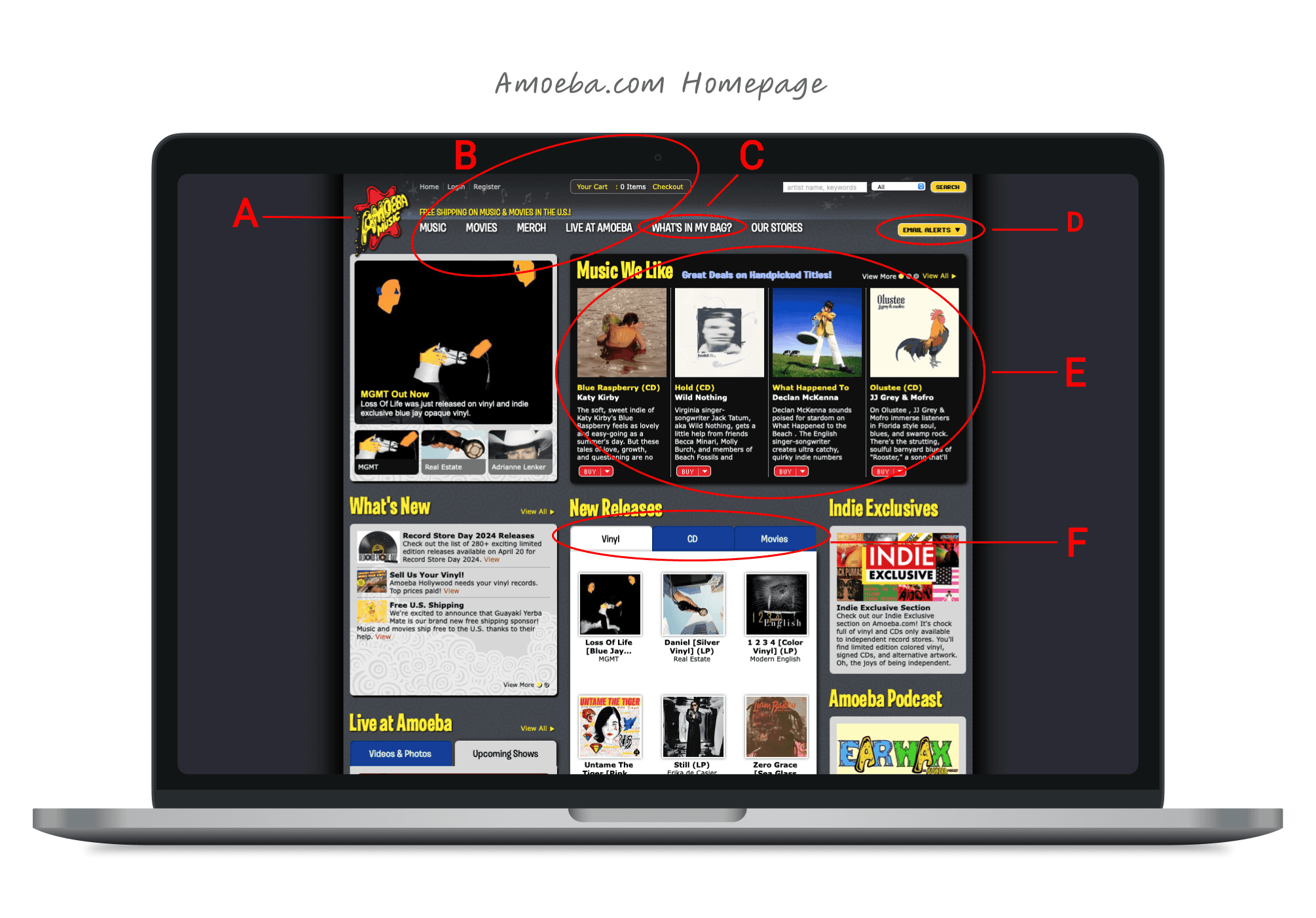
Homepage Annotations
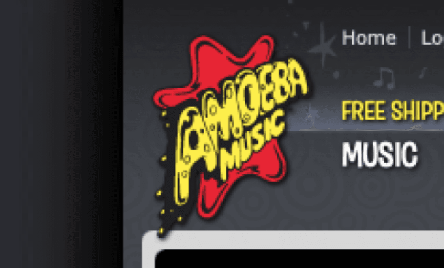
A
The brand logo does not have consistent clear space around it, and visual elements violate the logo borders, which is a clear "no no" in branding. The logo should be treated as a hero image and should feel special and separate.
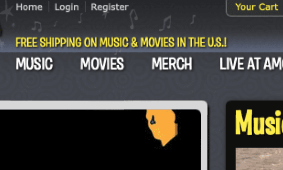
B
The main header is too busy! There are five (5) different navigation menus scrunched together. The left side is particularly problematic with three separate nav's plus an additional marketing message sandwiched together.
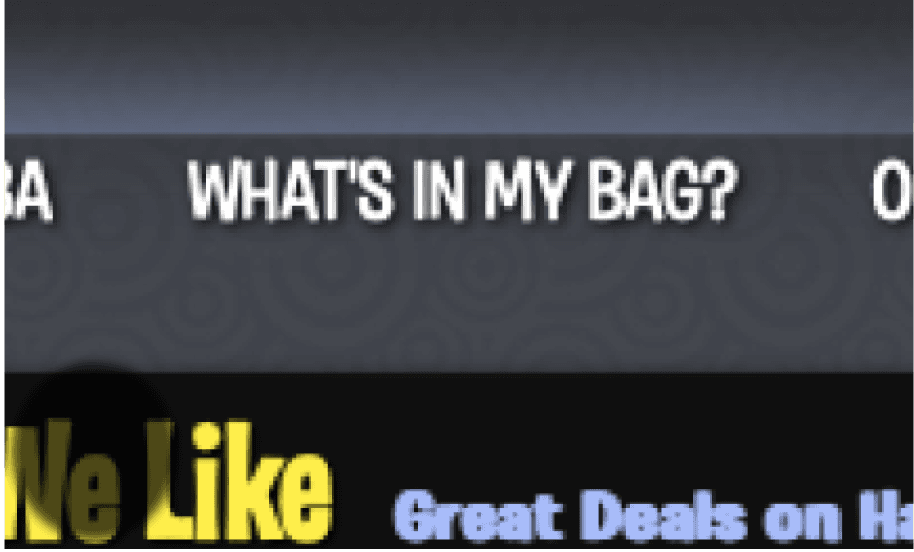
C
“What’s In My Bag?” It makes sense Amoeba wants to highlight this content, but this menu item is hard to read (font choice issue). Further, "What's in my bag" lacks context and does not invite me to explore it.

D
The Email Alerts drop down button feels out of place among the other navigation items. Also, using "email alerts" as a CTA to join their mailing feels like a misnomer.
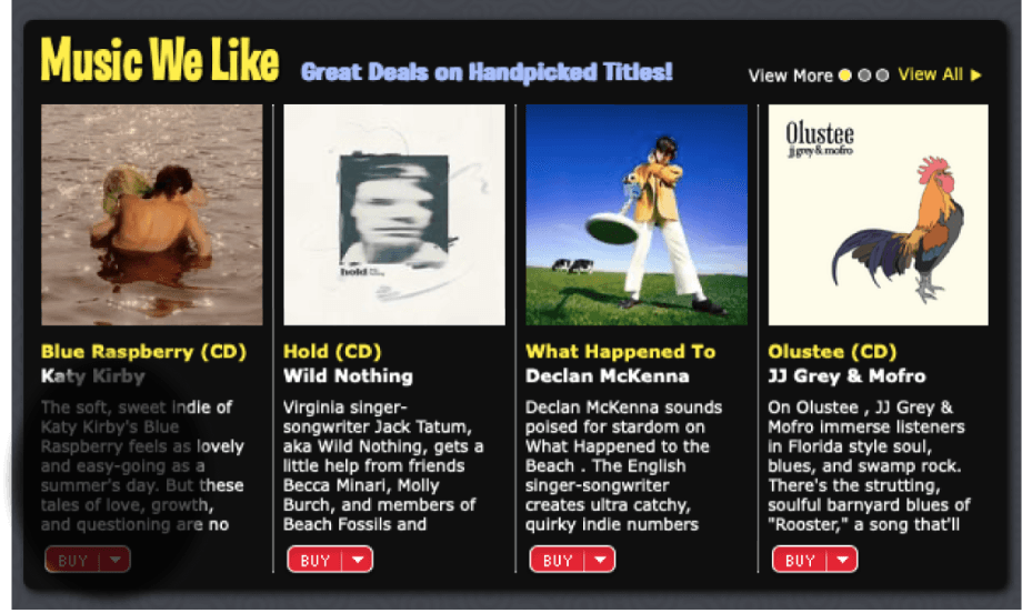
E
Music We Like. This important content is non-scrollable, so if you want to see more examples, you are forced onto another page. This impedes the user's ability to learn the website's heuristics and explore without bouncing to different pages.
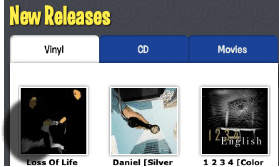
F
New Releases. This section uses tabs to deliver unique items for vinyl, CDs and movies. It would be much better to show new release examples of each category separately in different sections on the homepage.
In my competitive analysis, I was mainly focused on 1) shopability, 2) category design aesthetics, and 3) identifying the common patterns and affordances used in the category
Shopability
The first visual facet I focused on was shopability. I found Tower Records, Bandcamp, and Bleep to be the most shopable of the five competitors, each with clear sections, good use of negative space, and intuitive navigation. Strategic use of these three factors on a future Amoeba.com design is essential and would better serve Amoeba.com users.
Design Aesthetics
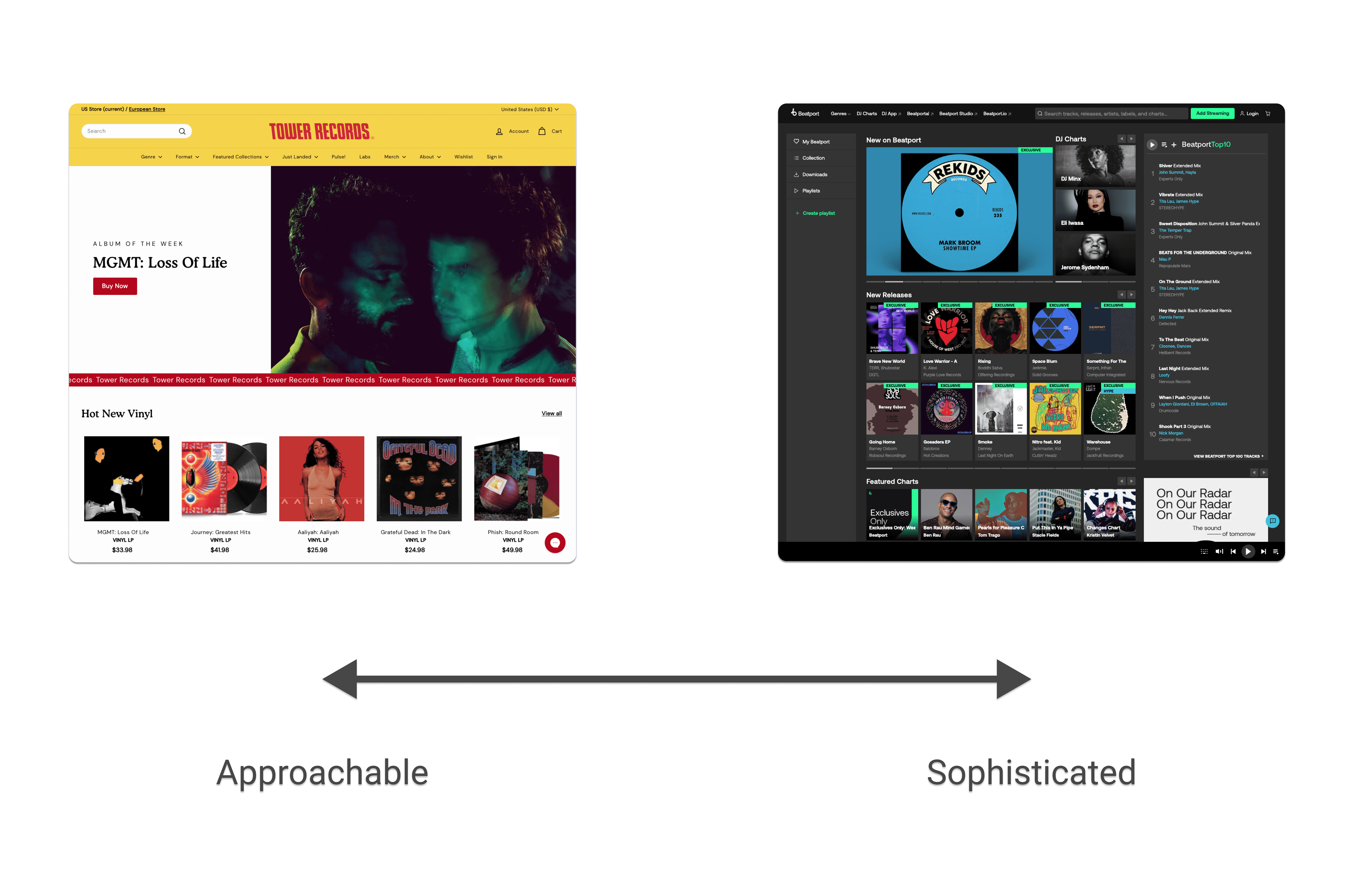
Elements of Spotify's design aesthetics ran through many of the websites I assessed, as did a tendency towards sophistication vs. approachability. I noticed how modern and subdued many looked versus the music websites I remember perusing in the pre-Spotify era. Examples I studied include Bleep and Discogs, as well as Beatport, which felt the most subdued and Spotify-esque of the three.
Tower Records was much closer to my memory of what it was like to shop for music online and felt more approachable.
These differing levels of Spotify-ness intrigued me. After collecting screen shots of all five competitors, I arranged them on a continuum, from least Spotify-like to most Spotify-like. See below, going left to right, top to bottom.
Key Patterns and Affordances
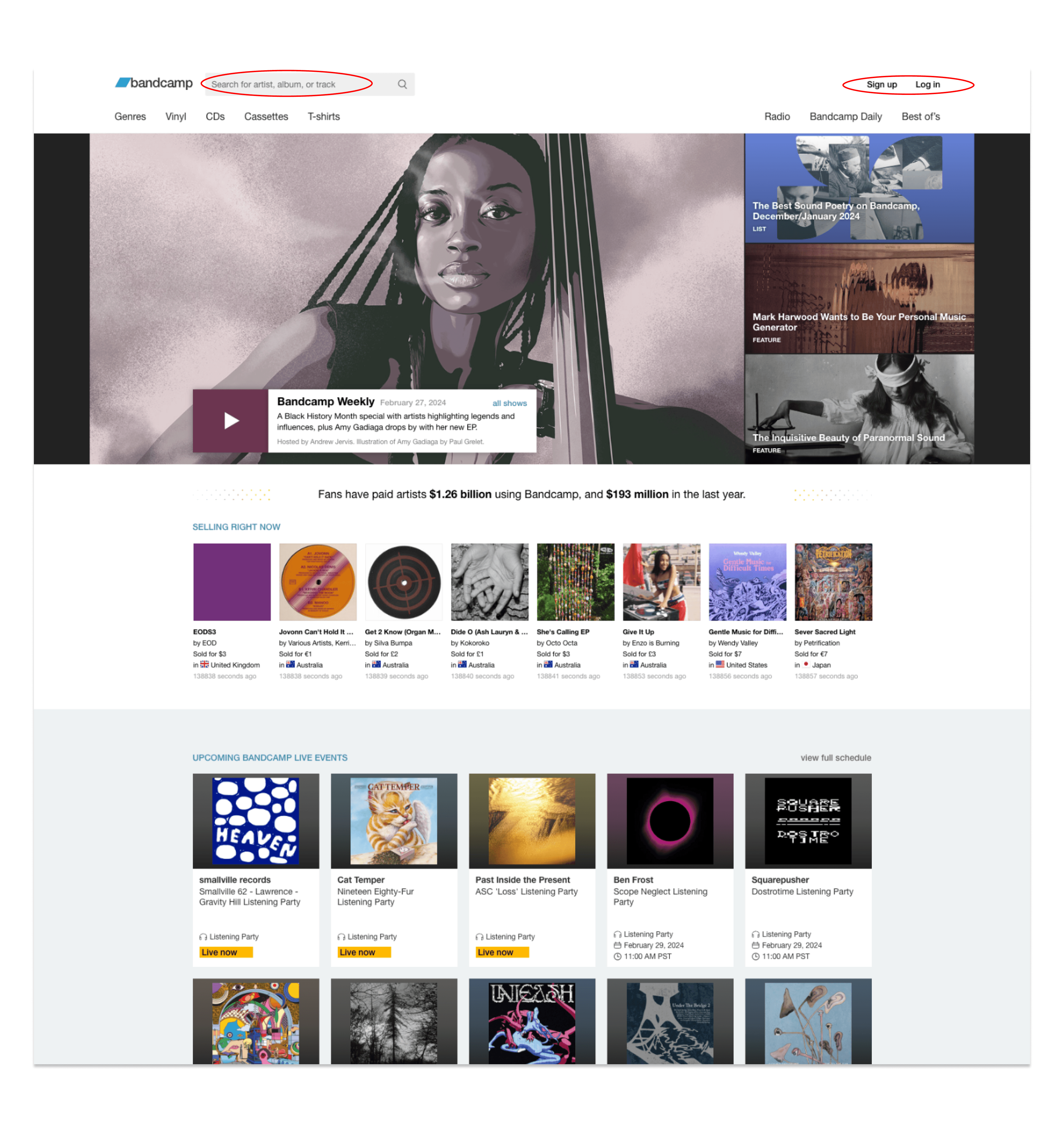
Bandcamp is a good example of the common patterns and affordances I found across the five competitors analyzed.
Search bar was typically found in the upper left hand corner
Sign up and login were typically found in the upper right hand corner
Homepage layout started with a banner image used to promote events, news, or new releases
Product cards are typically arranged in horizontal, scrollable sections
Negative space makes the different sections of content standout
When seemingly everyone listens to streaming music, why do certain people still buy physical music?
The user I needed to research for this challenge was clear: passionate music people who collect physical music despite the prevalence of streaming platforms. I chose to study passion music fans since I believed they would make up the bulk of Amoeba.com purchase, and thus their attitudes and behaviors would be most salient.
In planning the user research, I relied upon my deep research experience, developed over my 20-year career as a brand marketer and strategist, to develop a research plan that would inform the most important questions on this project. Specifically, who buys physical music, why do they buy it, how do they buy it, and what are their needs and pain points around buying physical music.
To answer the "who" question above, I devoted over half of my user interview time to understanding their attitudes, beliefs, and behaviors around music generally and physical music specifically.
In the second part of the interviews, I asked each user to perform shopping exercises on Amoeba.com and other eCommerce music sites. The prompts I used were very simple, for example, "purchase an album that you don't already have of a favorite artist" and asked them to narrate what they were doing and why they were doing it while I recorded them using the subject website.
Watching these users shop Amoeba and other music websites gave me a window into their learned shopping behaviors, website expectations, and patterns they expected to find in these experiences. It also fleshed out limitations and pain points of Amoeba's website design choices and what approaches worked better and brought joy at competitive sites.
In total, I completed six (6) interviews and then synthesized the results using affinity mapping.
Click the button below to reference the final affinity map organization.
Key Findings
Streaming music is the predominant form of music listing for all six users
Most users have positive brand perceptions of Amoeba, especially when they've had an in-store experience
Shopping amoeba.com is a very different experience – “this feels like a totally different company”
Generally users find Amoeba’s website to be super chaotic and over-stimulating
Many users compared Amoeba.com to a blog or a newsletter - "this doesn't feel like a website"
These users preferred to use the search bar for finding music vs. browsing the site
Amoeba's search results landing page is supper confusing
Amoeba’s cart experience needs improvement
User Personas
Stevie, the Avid Vinyl Listener, is a rocker. He's always loved music and plays an instrument. He grew up in a musical family, and his sister used to make mixed tapes for him when he was a kid. About 10 years ago he moved to Portland and met people who were really into listening to vinyl.
Those people became an important friend group for him, and he started collecting vinyl himself. He finds his way in music stores regularly because there are so many in Portland, and he enjoys checking out the used music collection and especially the bargain bin.
Today, listening to vinyl is a special occasion for Stevie, meaning he does it when he can unplug and focus on the music itself and the story it tells. For other music occasions, he almost solely listens to Spotify.
Kate, the Music Collector, is a KPOP fanatic. And it's not just the music she loves. It's also about the KPOP fandom experience. KPOP artists try to build special relationships with their fans, and Kate talks to her friends about KPOP artists all the time.
During the pandemic she had extra money because she wasn't going out, and she started collecting KPOP CDs, mostly for the goodies inside. Typically, KPOP CDs include a band member photo card, digital thumb drive, artwork, and a booklet. Some of her friends buy more than one copy of the same album because each package contains one of many photo cards (like old school Tops bubble gum baseball trading cards).
She puts the artwork up in her bedroom and displays the album books in her living room. Despite having a lot of physical music, she listens to music almost exclusively on Spotify.
One of the principal challenges of this project was reimagining the information architecture and improving the main navigation.
Header Navigation Analysis
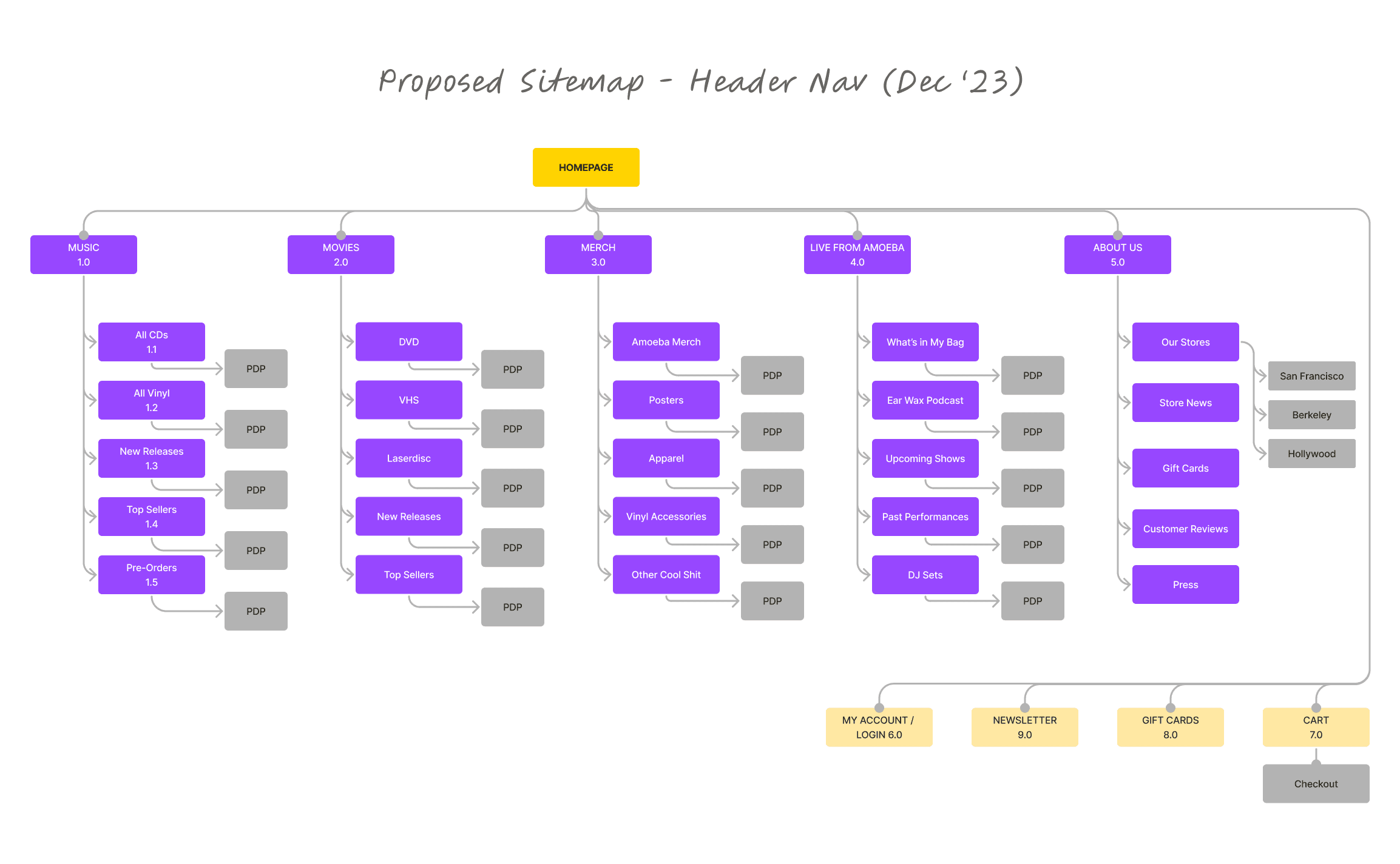
In this analysis, I break the overall sitemap into two pieces: one for the header navigation and the other for the footer.
Starting with the header, you can see that it is really hard to scan, with sixteen (16) separate clickable items organized in roughly six navigation sub-sections.
Digging deeper, there are six main menu items. Of the six, only three have any sub-navigation (Music, Movies, and Merch); the other three items are simple page links (Live at Amoeba, What's in My Bag?, and Our Stores).
Finally, the Merch nav item goes really deep, with 10 sub-nav items, which makes it very hard to shop and yet does not cover every type of merch.
Here's the existing sitemap:
I used card sorting to catalog Amoeba's selling units and improve the website's information architecture. There are approximately 40 different product types, including vinyl, CDs, DVDs, VHS, posters, keychains, mugs, t-shirts, and stickers. Of these 40, around 30 product types are general merchandise, i.e., not video or musical content.
Rolling up ALL 30 merch types into a smaller set of meaningful groups proved difficult. Instead, I focused on what I perceived as Amoeba's most important merchandise types (you can see my rationale for each, below). After I chose the first four sub-nav items, I still needed a catch-all category, which I named "Other Cool Shit". This feels very on-brand for Amoeba.
Footer Navigation Analysis
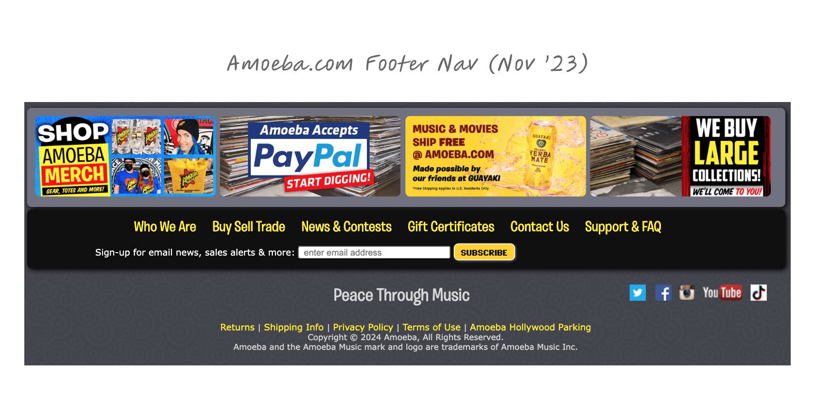
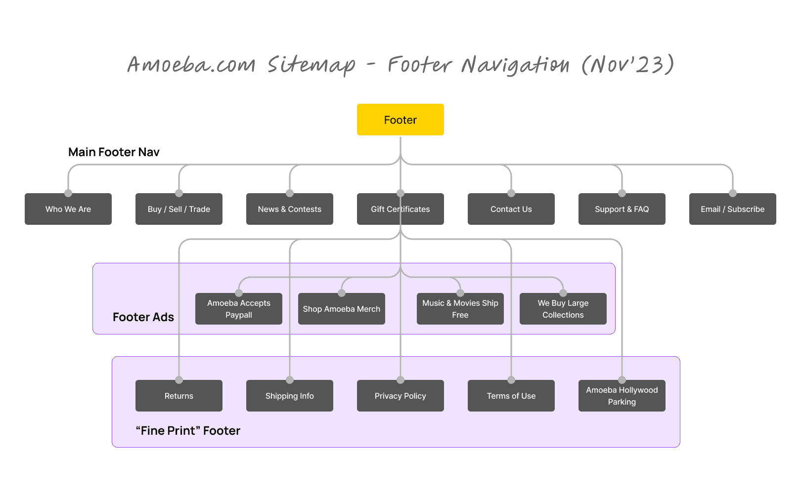
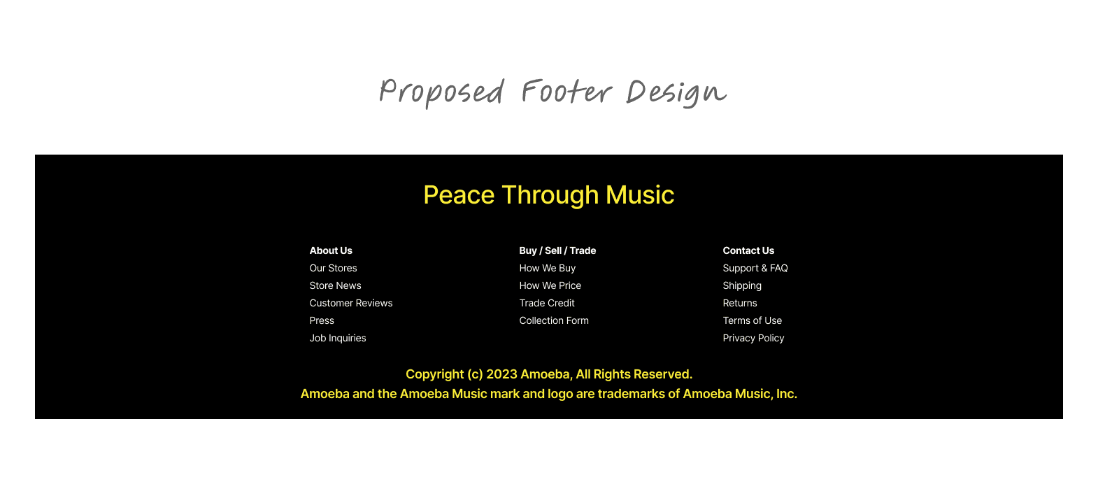
Amoeba.com's footer is also hard to digest. There are three types of footer links: 1) the main items (e.g., who we are), 2) the footer ads (e.g., PayPal), and 3) footer links lost in the fine print on the very bottom (e.g., Returns, Terms of Use).
While I'm not a big fan of the permanent ads that Amoeba runs at the bottom of their pages, I am a big fan of Guayaki so I enjoyed seeing that Guayaki makes possible Amoeba's for free shipping. That said, these ads are hard to read and don't invite further inspection (and clicks) so I would question their effectiveness.
Regardless, here are the links organized into a footer sitemap:
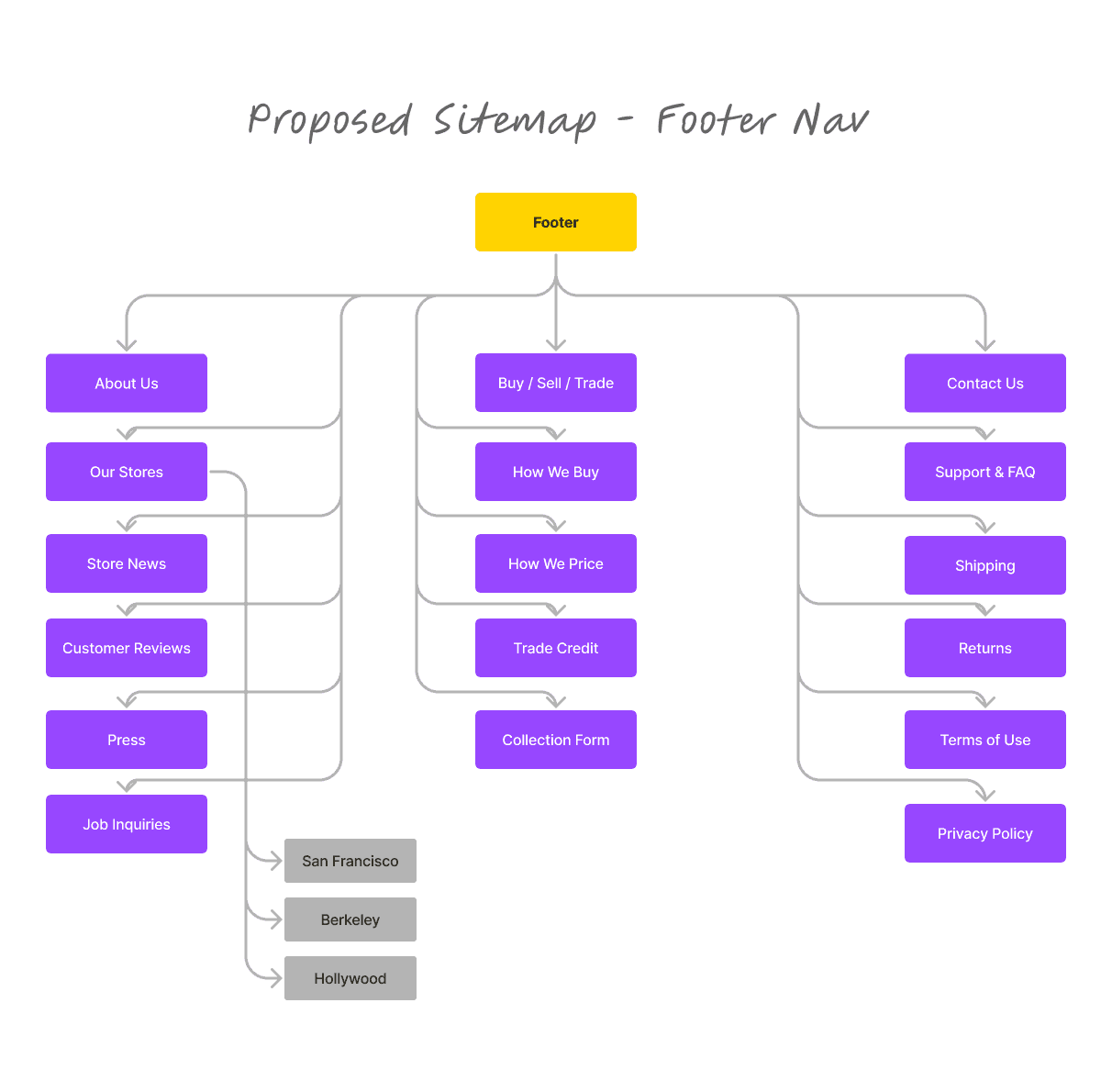
To create a new footer sitemap, I did an inventory of all the pages represented by the links in the current Amoeba.com site. This uncovered a handful of pages that where not indexed that felt important, e.g., all the links listed under "Buy/ Sell/ Trade" below.
The new design really cleaned up what was really messy and functionally hard to use.
