Work
Library Mobile App
THIS IS A SAVED COPY OF THIS PAGE FOR MY RECORDS.
How do you promote all the programs, services, and benefits of a modern public library?
Client
Role
Team Members
Timeline
[REDSIEGN THIS] Designed for LAPL
Project Mgr, UX Research Lead, UX Design
Natalie Wood and Tyler Gates
2.5 weeks
The Brief
The Brief
Revamp the user experience of a local library's app to showcase its diversified offerings.
Explore and present the range of items available for lending, along with programs and services offered.
Consider how the redesigned app can positively reshape the common perception of libraries, focusing on enhancing awareness about their varied services and programs.
Determine the target user(s) of this app.
Determine the Information Architecture for all services, programs, and benefits.
Create a search engine (concept) that doesn’t flood the user with tons of options.
Constraints
Choose a “local” library
Create a POC mobile or tablet app
Use iOS (HIG) or Android (Material Design)
Library app access is limited to card holders of that library
Tools
Figma and Figjam
Trello
Clockify
ZOOM
Fathom AI
SF Symbols and Fonts (Apple iOS HIG)
G Suite
Slack
Getting Started
With only 16 days to do this design project, we needed to get up and running FAST.
Deliverables
Public Library Offerings Analysis
Group Trello Board
Clockify Workspace
Project Time Estimates
The team kicked off the project on 12/6/23 by assigning tasks to each other. Given my consulting background, I volunteered to do the project management role and prioritized putting together a project plan, while the rest of the team focused on researching major libraries in the US and their avant-garde library offerings and services.

My first step was to break the project down into seven (7) phases [ADD PROCESS IMAGE BELOW showing the 7 phases], each with a detailed list of activities (created as Trello cards), and each activity with embedded checklists, start dates, and due dates. The phases were as follows: Startup, Research, Synthesis, Design, Prototype, Test, and Present.
To be able to track our time, I set up a Clockify board, assigning a unique project number for every activity. Using this system, we all kept daily timesheets for our work.


Once I completed these tasks, we met as a team too color code each Trello card to track who would lead that activity, and then added members to each card, signifying which team members would be involved.
Asking Lots of Questions
Deliverables
Research Plan / User Interview Questions
Library Offerings Landscape
Competitive/Comparative Analysis (Design)
User Interview Videos, Summaries and Transcripts
Online Survey
When's the last time you checked out your local public library's website?
Chances are it's pretty clunky and hard to navigate. Maybe it looks like it was designed back in the oughts. Public libraries have a lot in common in their digital efforts. Most don't have the funding or staff to invest in their online presence or in creating and managing mobile applications.
We searched dozens of public library websites and narrowed down our list to eight (8) that seemed to be best in class. Of those eight, LAPL stood out for its breadth of offerings, its multiple media labs and maker spaces, and its other non-traditional library offerings (e.g., memory labs). Those attributes plus a welcoming design aesthetic led us to choose LAPL for our project.

Interestingly though, LAPL's mobile app (see above) was not as thoughtfully designed as their website and seemed to have limited functionality. We suspect that most libraries who actually have a mobile app, pay a vendor to host their content on the vendor's white label app.
Competitive Analysis

We also started benchmarking the designs and functionality of other library applications, looking for patterns and heuristics around how users access library services. Three of the best we found were the New York public library, San Diego PL, and the Libby app, a fan favorite.
User Research
I planned the initial user research phase of the project, identifying the research objectives, key decisions to be made, and an initial set of questions for our initital interview targets: "library gurus" (people who work at libraries) and current library users.
As the team learned, I continued to update the research plan, sharpening its focus and attempting to keep the team on the same page while we all moved forward with interviews.
Stakeholder Interviews
Two days after we kicked off the project, I interviewed a philanthropy director who works closely with Denver Public Library (DPL). We did a deep dive into how DPL was investing in counseling resources and other services, and how they had just launched a mobile app.
Later sharing this interview with the team, we finalized four types of users to interview: library users, non-users, library gurus, and people who is passionate about making things, either physically or digitally.
User Interviews
The team interviewed eleven (11) potentially users with a good cross-section of passionate library users, non-users, and makers, the latter to get feedback LAPL's media labs and other "avant guard" library offerings.
My primary tool for documenting user interviews was ZOOM paired with Fathom AI, which generated a video recording, interview summary, and transcript of all my interviews.

Key Learnings
Perceptions of libraries stratify across generational lines: older users tended to be more passionate about libraries while younger users perceived them as being outdated and old-fashioned.
Users who were passionate about libraries tended to have formative childhood experiences around libraries that have stayed with them throughout their adulthood.
Even those who perceived libraries as being outdated were intrigued and a little excited about non-traditional services like media labs and borrowing power tools.
Not (yet) Ready for Design
Given the scope of the project, it was important to get a variety of viewpoints, which left us with A LOT of data that needed to be synthesized quickly.
Deliverables
User Insights (Affinity Mapping)
Personas
Problem and Solution Statements
Feature Prioritization
Site Map
Affinity Mapping

In preparation for a Figjam session, each of us converted our notes into virtual stickies as well as summarized the key learnings that would be most helpful for crafting personas later (see above).

Next, each team member assembled their own user data into clusters of I-statements, e.g., "I love exercising my creativity" and "I'm now aware of what libraries offer"), Then through two marathon ZOOM sessions, the team did multiple iterations of combining (and breaking apart) I-statements to build clusters of overall themes. We did this until we we felt like the themes were actionable for persona development.
In total, we developed over 60 different themes.
Persona Development

The key now was to determine which theme or dimension would help us most differentiate two or more personas. We focused on identifying attitudes and behaviors that could help us segment users into distinct consumer targets.
To do this, we tried multiple combinations of continuums on X and Y axes, and then mapped each of the interviewees on the resultant graph to see where we might have user clusters.
The continuum from library skeptic to library enthusiast worked well as a differentiator and became the Y-axis.
After trying out various other dimensions, we chose a continuum of spending more time consuming media (books, videos, etc.) to spending more time creating and making as our X-axis.

This final persona matrix resulted in two different clusters: one, a library enthusiast user who still used the library for accessing media (mostly borrowing ebooks and audiobooks), and two, a "maker" user who was open to using libraries, creative tools were available (think media labs, 3D printers, borrowing power tools). We named them Katrina and Cameron.
We decided not to create a third persona for those users who were more skeptical of libraries, assuming that marketing to highly skeptical users would not be a wise investment for LAPL.

NEEDS
Always wants to have a digital book on hand
Wants to be more informed on her local library resources
Will always support library funding.
PAINS
Gets confused with the process and apps involved with getting ebooks onto her kindle
Waiting for the book she wants to read
Hates waiting for the next book to come out in a series
BEHAVIORS
Avid reader. Her biggest hobby
Consumes video content, esp Netflix
Primarily uses the library’s website to access ebooks (kindle) or audiobook
Exposed her child at an early age to libraries
ATTITUDES/ BELIEFS
Passionate about libraries and the services they provide, especially for underprivileged people
Wants to learn more about her library services
Loves the convenience of being able to access and store many books on her Kindle
Problem and Solution Statements
Now that we had well defined personas in Katrina and Cameron, it was time to formula their problem statements.
Katrina
Katrina needs a better way to discover how to engage with her new local library because she just moved to the city and doesn’t know how to get more involved.
Carson
Carson, a recent college grad, needs access to a cost-friendly recording space because he no longer has access to his college music production studio and he doesn't have the funds to buy his own equipment.
Solution Statement
Create a new mobile app for LAPL that provides a personalized user experience that promotes relevant services and programs based on the unique needs and interests of the user.
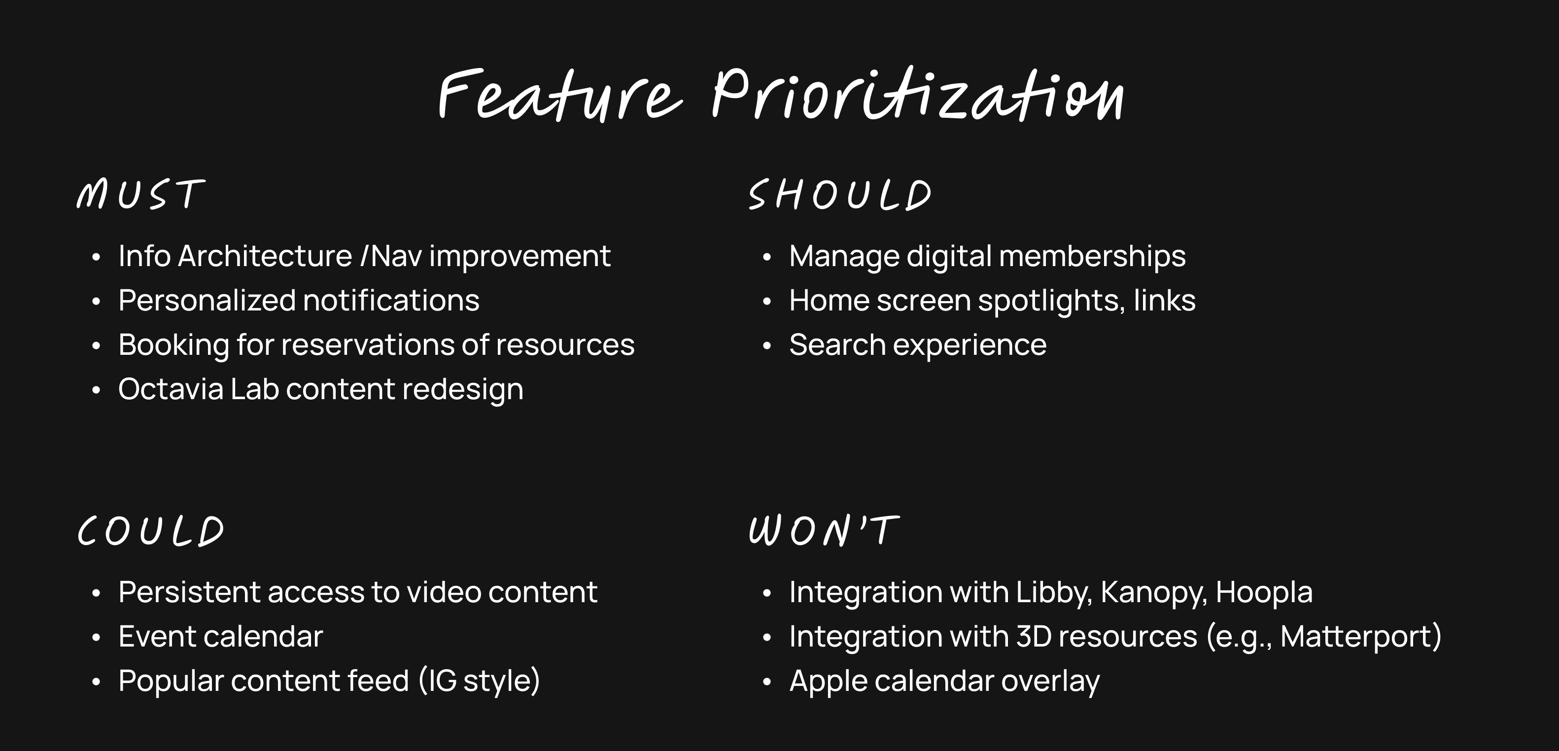
Feature Prioritization
To kick things off, we decided that this mobile app would encompass ALL offerings of the LAPL. (alternatively, we considered an app solely focused on the library's media labs.) Given the importance of providing a customized experience to their users, this approach seemed more in the spirit of the brief.
With that decision made, the team came up with a large list of possible mobile app features:
Information arch and navigation Improvements
Personalization and custom notifications
Phone-based library orientation
Digital memberships incl. media labs
Booking reservations for resources and spaces
Homepage spotlights
Integration with Libby, Kanopy, and Hoopla
Search experience
Octavia Lab redesign
Persistent access to video “how to” content
Events
Improve access
Integration with 3D virtual spaces
What’s popular in the library (e.g., IG scroll)
Next, we did a Moscow analysis of these features, and came up with the following must's, should's, could's, and wont's.
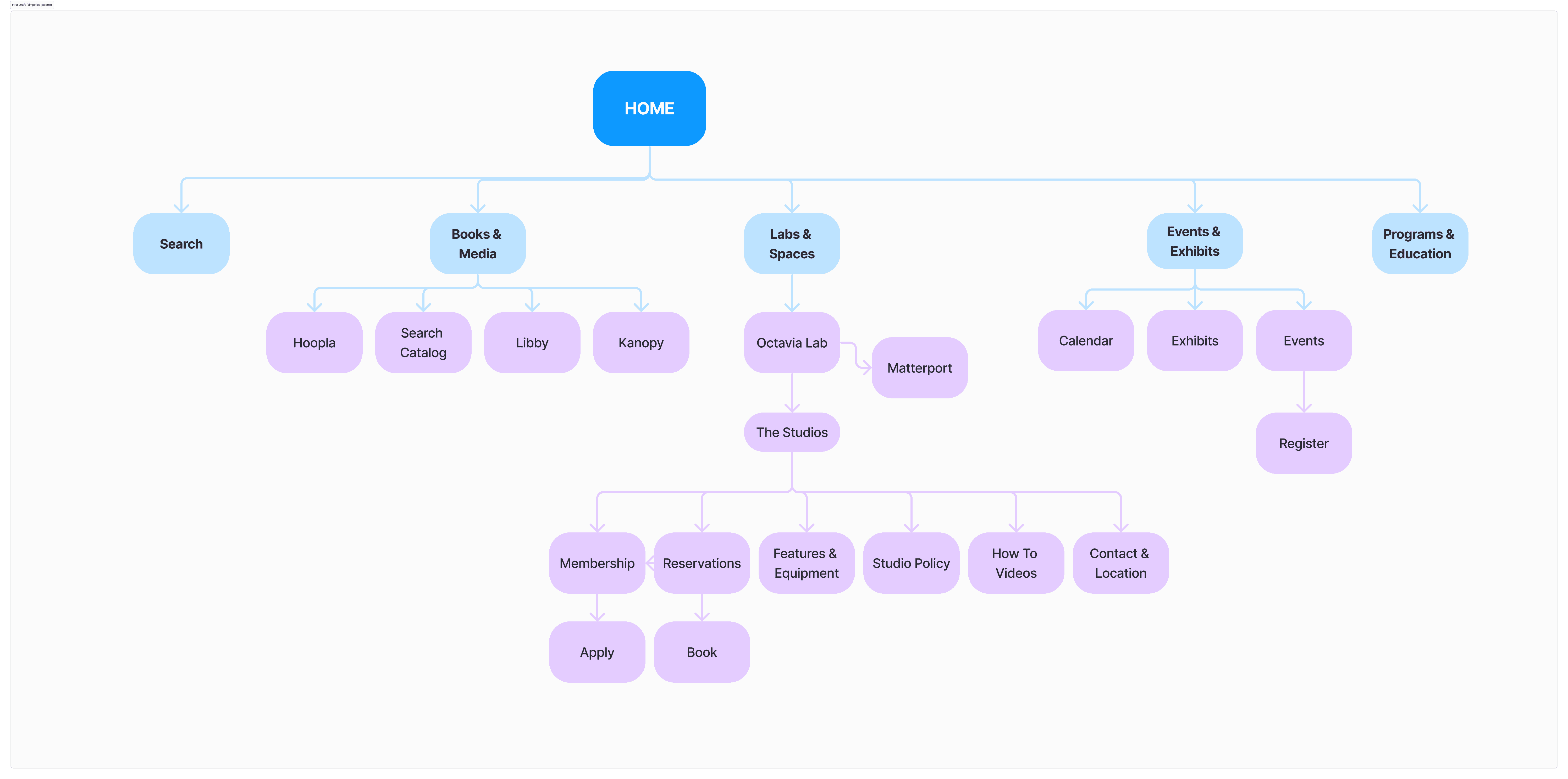
Site Map
The final step before we could begin our designs was reimagining the information architecture for the entire LA Public Library. This was obviously no small task so we needed to limit the scope of what we would touch. One of my teammates initiated this process by downloading the current site map for the LAPL (and it is massive!).
Design
text text test ??
Deliverables
Sketches
Lo-fi wireframes
Lo-fi prototype
this text is for synthesis
User Testing
text text test ??
Deliverables
Research Summaries
Affinity Mapping and Themes
Personas
Problem and Solutions Statements
Feature Prioritization
this text is for synthesis
Next Steps
we would do this
and this
adn this
and
adn
and
Personal Learnings
Bold statement about how I grew as a designer…
Project Management
WIP / NEEDS EDITING
learning for project planning
-- starting out with a number system for projects/activities/tasks will help everything run much smoother
-- deciding to create 7 projects so we can use Clockify's task features (originally I had one projects and was building >30 tasks
-- starting the project planning process in Trello with the team would have been ideal - just crank it out in one team session - activities, tasks, deadlines. I created it and then we evolved it over time - need a higher sense of urgency on day 1
You could break it up. Have each team member choose one activity and break into tasks and sub-tasks in Trello
Research
WIP / NEEDS EDITS
needed to spend more time on getting to know my respondents - hobbies in particular. I think i was so panicked about getting through everything I deprioritizes that part of the questionnaire.
we could have done a checkin earlier in the process to check the kind of data we were getting oin our user interveiws - drive common approach - it brings up more questions.
My approach was more exploratory. Tyler more specific, where he had users actually use the LAPL website including use of the Octavia Media Lab content
Design
here's what I learned
Prototyping and User Testing
here is what i learned
Thanks for stopping by.
© 2024 – 2025 Robert Eisenbach. All rights reserved.